Thursday 18 November 2010
Barney Bubbles // Paul Gorman
Barney Bubbles is the the enigma behind many a classic album cover, and a man who I was intrigued to learn more about in our recent lecture by Paul Gorman, a Journalist and Author of the book "Reasons to Be Cheerful: The Life and Times of Barney Bubbles".
I know of the work of Barney Bubbles (or Colin Fulcher as his mother once knew him) having been advised to look into him last year for a project. However, I evidently didn't know all there is to know. Paul took us through not only his work but also the story of his life. The story of a depressive, very private, troubled man whose legacy has almost been lost through his own penchant for pseudonyms and his wish to not become a known name. However it has somewhat become Paul's mission to resurrect his work and bring Barney Bubbles to a whole new audience.
Barney began his 'career' whilst at Twickenham College of Art where he designed posters for numerous bands including an early Rolling Stones. The name Barney Bubbles comes from his practice of creating ink projection shows as a backdrop for live bands. He termed these 'Barney Bubbles Light Show' (having already been going by the name Barney for some time) and it just seemed to stick. He left college and proceeded to work for Michael Tucker + Associates, London and later The Conran Group working for such brands as Pirelli, Strongbow and Habitat. When he left Conran he went into business with two colleagues and began his association with designing music sleeves.
It was in the early 70's when his rich association with Hawkwind began. Designing sleeves for various albums and creating backdrops and props for their live shows. He designed for them them right upto 1977 when he joined Stiff Records.
It was then and right up 1981/2 where, I believe, he created his best work. He created sleeves, most famously, for Elvis Costello, The Damned and Ian Dury. He was working freelance aswell and created numerous works under various pseudonyms, many of which Paul Gorman believes will never be accredited to him. His work through this period is some of my favourite of his. What is termed as his 'signature style' was evident at this time in work such as the 'Armed Forces' cover below and the 'This Years Model' sleeve at the top. I love his use of deliberate mistakes such as the off-register on 'This Years Model' revealing the printers marks (a technique 'borrowed' by Peter Saville for New Order's 'Blue Monday').
Paul talked about Barneys life with the gusto of a man obviously deeply involved in his subject. His quest to get Barneys name where it should be is helped by the fact that he is already a bit of a 'designers designer' with luminaries such as Peter Saville and Malcolm Garrett already signed up to the Barney Bubbles fan list. This was a totally inspiring lecture for me as some of the work on show I really appreciate and in particular "This Years Model' which I am totally struck on. What a fantastic piece of playful, direct, simple design/photography. Wondrous.
I myself am signed up on the ever growing list of inspired fans.
Wednesday 17 November 2010
A Love Story In An Absolut World
We were recently visited at work by a lovely lady from Absolut Vodka as part of a promotional push for the brand. Whilst there she mentioned some of the advertising that Absolut are famous for. She also mentioned a short film created for them by Spike Jonze. Being an interested admirer of his work I thought I should check it out.
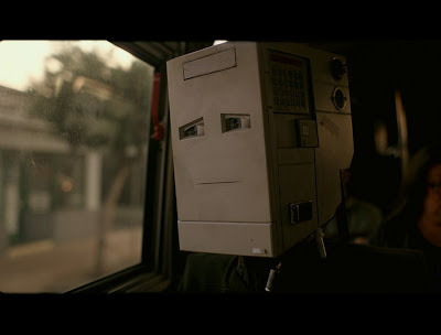
"I'm Here" is a robot love story based on 'The Giving Tree' by Shel Silverstein. In a world co-inhabited by robots and humans this is a humorous yet at times saddening depiction of an unforgiving love for another, regardless of situation.
Brilliantly shot and a well told story this is well worth the watch. And not only is the film great the website is special in it's own right. A series of full screen videos allow you to walk into the cinema and take your seat for the latest presentation. An experience that really adds to the film. Check it out.
// www.imheremovie.com
Tuesday 16 November 2010
Teal Triggs
I was privileged enough recently to be in the audience for Teal Triggs' Fanzines: A DIY Revolution lecture. I have only recently heard of Teal but she proved to be a very interesting speaker. As somewhat of an authority on the art of fanzines she gave us an insightful talk on what it is to be a fanzine creator, the origins of the 'zine' and some of the best examples from over the years.
"What is a fanzine?' was the first question she posed upon us. And with a mixed response she answered it herself (with a little help);
"...little publications filled with rantings of high weirdness and exploding with chaotic design." [Stephen Duncombe 1997]
And this was precisely what she preceded to show us. We took a leap through history from the early 1960s and early zine culture, through the Punk era and the boom of zine 'manufacture' that coincided with the angered politics of the time, right up to rave culture publications in the 90's. What was particularly insightful to hear was the association with Manchester/Northwest and the zine scene. I am aware of the culture I am living in and the history that surrounds me and so was aware of the certain element of zine culture that exited/exists here in Manchester. What was nice about it though was the fondness with which Teal spoke about some of her favorite zines, all from in and around the Northwest.
As she left us she posed another question. An obviously poignant one to her. In the current times of rapid knowledge and the dominance of the internet "Are zines still relative? Is there still a revolution going on?"
Always.
Busy Busy
Yes, yes its been a while. I have an ever growing list of things I keep meaning to blog about but just struggle to find the time. However tonight is the time. A few updates over the next couple of hours should get me back on track. Bear with me.
Just a little note, I am now on twitter if anyone would care to follow me. Or secondly if anyone has come here from my twitter then you may care to follow this blog aswell. If you'd be so kind. Links on the right.
TA.
x
Just a little note, I am now on twitter if anyone would care to follow me. Or secondly if anyone has come here from my twitter then you may care to follow this blog aswell. If you'd be so kind. Links on the right.
TA.
x
Wednesday 20 October 2010
Flyer Design / Re-Design
As well as being a Graphics student I, as many students are, am also a barman. As such I have to suffer the terrible incompetence of my peers when it comes to menu/leaflet/point of sale designing. So when it cropped up in conversation that I was a Graphic Designer I was more than happy to be asked to design some stuff for them. From editing their power-point slides (?) to designing promo cards and Christmas menus, everything with a hint of a graphical element was passed onto me. Anyway, it was to my horror this weekend when I spotted this monstrosity of a flyer in the office...
(sufficient to say, I did not design this!) Apparently we are to host an Electro 80's night. All sounds good. However, the company that are organizing it (we are just providing a venue) and the 'designer' they hired are idiots. Not only did they think this flyer would attract the 300+ people that they claim to be able to get but, when we rang up to enquire about the horrendous pixelization of our logo and offer them an high res copy of it they replied with "well we just got the logo off your website and we can't change it now we've had already had 1000 printed." Idiots. Anyway, I did find a use for this today. In G-Man's skills session we were given the task of 'taking a shit flyer and making it better'. I had perfect fodder. An hour and half later...
Using exactly all the type that was on the original and using the obvious themes of Peter Saville's Blue Monday cover (and also his Grayscale font) and the 80's colour palette I managed to create a clean, concise, relevant version that I would say would appeal to more people than the original.
If only I knew about this sooner...
Sunday 17 October 2010
Cardon Copy
Came across this little article in The Guardian about a group of designers in New York who, in partially their own words; "Hijack these unconsidered fliers, redesign them overpowering their message with a new visual language and then replace the redesign back in its authentic environment". A lovely little idea and actually some really strong design work. I'd be interested to know if the fliers actually warranted any more of a response with their new designs? I would certainly look more than twice at some of these posters. Well worth a look at the designers portfolio as well. It's choc-a-bloc with great illustrations, book designs and posters. A new favourite of mine methinks.
Cardon Copy // Cardon Design
Saturday 16 October 2010
Helvetica. Period.
I finally got around to watching Helvetica in it's entirety recently after only ever watching it in the background whilst I'm working or little bits here and there. Now, for me, it's a fantastic film. It may be a bit geeky and it may not be to everyones taste but I loved it. It is brilliantly shot with a great soundtrack that I think brings alive what could be quite a dull subject matter to those who aren't particularly interested in typography or design. I actually think it is so well made that it could fairly easily cross over and interest the 'non-graphical' public as it is generally a very captivating documentary. There are some great interviews with design legends such as Wim Crouwel, Massimo Vignelli, Neville Brody and some fantastic insights into the minds of Erik Spiekermann and Michael Bierut. A much see for designers and interested public alike.
(Just a little extra: check out El Ten Eleven who provided a lot of music to the soundtrack.)
Thursday 23 September 2010
What (and what not) to do this year...
As it's the start of the new term I figure I need to know what to do and what not to do as regards design trends this year. Handy then that I stumbled across this lovely little manual from Elliott Scott and Christopher Doyle. Turns out everything I planned to do this year I should have done last. Behind the times? Maybe? Attempting to be intentionally humorous to fill out this blog post? Definatly.
Visit trynotto for a better look at this beautiful little booklet.
Visit trynotto for a better look at this beautiful little booklet.
Wednesday 8 September 2010
Back To School
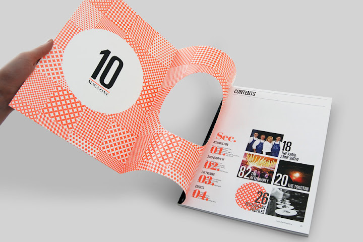
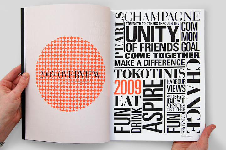
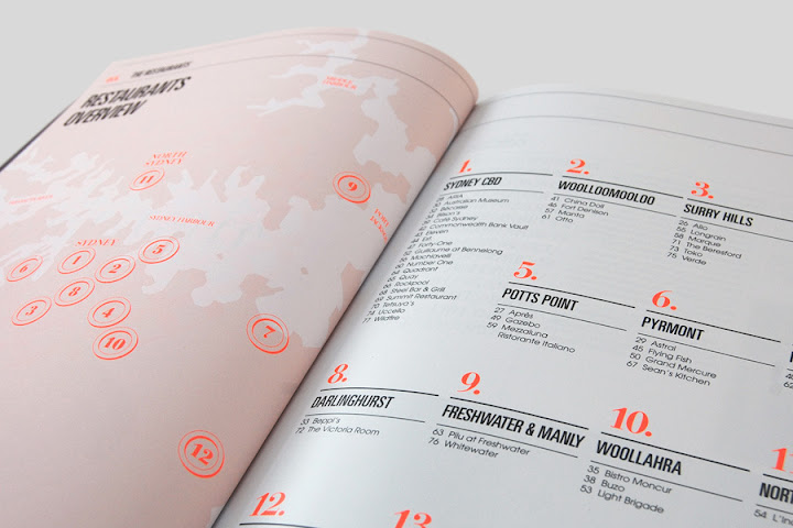
Its been a while but, as I promised myself, I am back on the blogger trail. It's almost that time of the year when we all head back to school and, as so, I have to start working properly again. After doing numerous shite design jobs for people who know nothing about design (or even what is generally accepted as looking anywhere near nice) I will be glad to do work for people who actually know what they are looking at again. Anyway, doing some intrinsic research I stumbled across Gareth Procter. Having a need for cleanliness and preciseness I found some of his work very appealing. His '10' magazine is especially prettyful. Check it out.


Thursday 8 July 2010
Bye Bye Mill Point
After a year of living and three days of frantic cleaning, fixing, disassembling and packing the time has finally come for me to move out of Mill Point. It seems only two minutes ago when my room was last in this state and I was moving in back in September. Although I have not actually lived here as long as some I do have a lot of memories. I have been around here for 3 years now and for every night out in town I had there was always a place for me on 'my' sofa back at Mill Point(a place that was, this year, taken by a Mr Arran Murphy) It was strange enough actually coming back to my own room and no doubt it'll be weird knowing I'll likely never be back at all now.
Ah well, on to pastures new...
Wednesday 19 May 2010
I Wish I Could Draw
 Found this beautiful work by Robbie Porter. His website has a massive collection of his designs and illustrations. He does a lot of 'play on words' pieces that i'm loving. I'm not normally a big fan of illustrations, I appreciate them for what they are but don't normally love them. These I love. Very simple but that pleases me. If I had the money I would definitely buy some. But then again that could be said for most of the things I see on the internet.
Saturday 15 May 2010
Uncovered
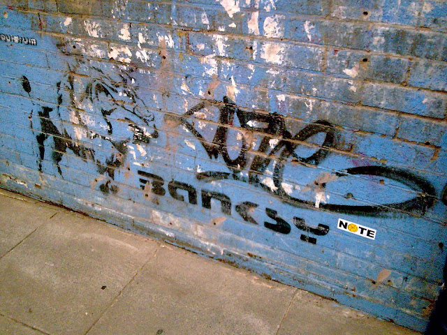
I've been saying for a while I am going to start a blog but never got round to it. Well now I have. And it seems I have a good post to start with. After visiting the Dr. Me 'An Apple A Day' opening night at Common (and taking full advantage of the free gin) I then walked back past the little substation on Tib St. and thought nothing of the construction work going on. It wasn't until I spotted Alex and Scanners paying it extra attention that I noticed what it was. Apparently, a day or two earlier, what is thought to be a genuine Banksy mural was uncovered by workers clearing foliage from the wall. I was quite excited to spot it as I am a fan of Banksys work and its quite an event when you see a piece of work like this, especially in your own town. I used to walk past one of his murals nearly every day when I was at college until finally the weather (and I expect the council) washed it away. I also searched out one of the more famous ones when I was in Bristol earlier on this year (see) but it's quite exciting for me to have another one found in Manchester.
Subscribe to:
Posts (Atom)


